Visual Content 101: How Beginners Can Create Eye-Catching Social Media Posts in 2026

Let's be honest: scrolling through social media can feel like visual overload. Every day, millions of posts compete for attention, and the ones that stop you mid-scroll share something in common—they look intentional. They're not necessarily designed by expensive agencies or professional designers. They're created by people like you who understand a few simple design principles and know how to apply them strategically.
The truth that nobody wants to admit? Professional-looking graphics don't require professional design skills. They require understanding how color works, knowing where to place elements on your screen, and choosing readable fonts. That's it. These aren't mysterious talents bestowed upon designers at birth. They're learnable rules that anyone can master.
Whether you're a small business owner posting about your products, an entrepreneur building your brand, or a content creator trying to grow your following, this guide will give you the confidence and practical knowledge to create visual content that actually works. By the end, you'll understand why some posts get scrolled past in milliseconds while others stop people in their tracks—and more importantly, you'll know exactly how to create the latter.
The Foundation: Design Principles That Transform Your Posts
Before we talk about tools or platforms, we need to talk about the fundamental principles that separate mediocre posts from ones that genuinely engage your audience. These principles are the scaffolding that holds every successful design together. Think of them as the grammar of visual communication—once you understand the rules, everything else becomes easier.
The magic of good design isn't magic at all. It's the intentional application of color theory, composition rules, and typography principles that work together to guide your viewer's eye exactly where you want it to go. When these elements align, something almost magical happens: people don't just see your post, they feel it. They stop scrolling. They pause. And most importantly, they engage.
In this section, we're going to break down the core design principles that professional designers have been using for decades. You don't need expensive software or years of training to use these principles—you just need to understand them. Once you do, you'll start seeing design everywhere, and you'll recognize why certain posts work while others fall flat.
1. Understanding Color Theory and Psychology in Social Media Design
Color is your most powerful tool for evoking emotion before someone even reads a single word. The colors you choose literally trigger psychological responses in your audience's brain. Red makes people feel urgency and excitement. Blue creates trust and calm. Yellow energizes. Understanding this isn't pretentious design theory—it's practical psychology that directly impacts whether people engage with your content.
Let's start with the basics. Every color sits on a spectrum with psychological associations. Warm colors (reds, oranges, yellows) feel energetic, passionate, and urgent. They're fantastic for calls-to-action like "Buy Now" or "Limited Time Offer." Cool colors (blues, greens, purples) feel calm, trustworthy, and professional. They work beautifully for posts about wellness, finance, or anything requiring trust. Neutral colors (grays, blacks, whites) provide balance and sophistication.
Here's where it gets practical: you don't need to memorize color psychology charts. Instead, think about the feeling you want your post to evoke. If you're promoting a flash sale, you probably want urgency—reach for warm colors. If you're sharing wellness advice, cool colors will reinforce your message. If you're building a luxury brand, neutrals with one accent color screams sophistication.
The real game-changer is understanding color harmony. Your eye naturally gravitates toward posts where colors work together rather than fight each other. The simplest rule? Use the 60-30-10 formula. Pick one dominant color (60% of your design), a secondary color (30%), and an accent color for emphasis (10%). This creates visual harmony without feeling boring. A post with a soft blue background (60%), white text and elements (30%), and coral accents (10%) feels intentional and balanced.
One more crucial point: contrast. Your text absolutely must contrast with your background. If you can't read it easily, your audience won't bother trying. Dark text on light backgrounds or light text on dark backgrounds. That's it. Avoid placing text over busy images without a semi-transparent overlay—it's one of the fastest ways to make a post look amateurish.
2. Essential Design Tools for Beginners: Canva, Adobe Express, and Figma
The good news? You don't need to choose between expensive software and limitations. In 2026, there are genuinely excellent free and affordable tools that produce professional results. Let's walk through the three that matter most for social media beginners.
Canva is the entry point for most people, and for good reason. It's intuitive, has thousands of templates, and takes about 30 seconds to create your first post. Here's your step-by-step process: Start by selecting your platform (Instagram, TikTok, etc.—it auto-sizes correctly), choose a template that matches your vibe, customize the colors by clicking on any element, swap the stock images for your own or find new ones within Canva, and adjust text to match your message. The real power of Canva is its template library. You're not starting from scratch; you're starting from a proven design that you're personalizing. For most small business owners and content creators, Canva is genuinely all you need.
Adobe Express sits in the middle ground. It's free, it's powerful, and it feels more like "real" design software without the overwhelming complexity of full Adobe Creative Cloud. The workflow is similar to Canva but with more control. You can create from scratch or use templates, but the tools for manipulating design elements are more sophisticated. If you want more control over spacing, layering, and fine-tuning, Adobe Express rewards you with more precision. Start with a template, then dive into the design panel where you can adjust spacing, shadows, and effects with pixel-level control.
Figma is the professional-grade option that's surprisingly accessible. It's primarily known as a collaboration tool for design teams, but it's brilliant for creating consistent visual systems. Here's why it matters for beginners thinking long-term: Figma lets you create design systems. You build a set of components once (like a button style or text style), and then you can reuse them across multiple posts. This is how you build visual consistency at scale. The learning curve is steeper, but the payoff is massive if you're creating lots of content. Start with Figma's templates, explore the design system features, and gradually build your own reusable component library.
Pro tip: Start with Canva. Seriously. Master the fundamentals there, then graduate to Adobe Express if you want more control, and eventually explore Figma if you're creating content at volume. There's no shame in using templates—even professional designers do. The difference is they understand design principles well enough to customize templates effectively.
3. Typography Best Practices: Font Pairing, Readability, and Hierarchy
Typography is where most beginners stumble. They pick fonts that are technically readable but feel chaotic together, or they make text so small that people can't read it on their phones. Here's the truth: typography is 95% about choosing the right fonts and arranging them logically. It's not about being creative with fonts. It's about being intentional.
Let's start with font pairing, because this is where you can instantly elevate your posts. The rule? Pair a serif font (the fancy one with little feet) with a sans-serif font (the clean one without feet). That's it. One for headlines, one for body text. Serif fonts feel traditional and elegant. Sans-serif fonts feel modern and clean. Together, they create visual contrast that guides your reader's eye. A great example: use a bold serif font for your main message and a clean sans-serif for supporting text. This contrast makes the hierarchy obvious.
Speaking of hierarchy, this is crucial. Your post should have a clear visual order. What's the most important information? Make it biggest and boldest. What's secondary? Smaller and lighter. What's supporting? Even smaller. When someone glances at your post for two seconds, they should instantly understand the hierarchy of information. Most beginner mistakes happen when everything is the same size and weight—your eye doesn't know where to look first.
Readability rules are non-negotiable. Use a minimum of 24pt font for body text on social media (remember, people view on phones). For headlines, go bigger—36pt or larger. Never place light-colored text on light backgrounds or dark on dark. Use sufficient spacing between lines of text (line height should be 1.5x your font size at minimum). And here's a beginner mistake I see constantly: using more than three fonts. Stop. Stick with two fonts maximum. One for headlines, one for everything else. This instantly makes your posts look more professional.
One final typography tip that changes everything: letter spacing. Adding a tiny bit of space between letters (called tracking) makes text feel more intentional and easier to read. In Canva and Adobe Express, you'll find this in the text settings. Increase it slightly for headlines and decrease it slightly for body text. This subtle change is invisible to most people, but it's the difference between looking amateur and looking polished.
Composition and Visual Strategy: Creating Posts That Stop the Scroll
Now that you understand the foundational principles of color and typography, let's talk about composition. This is where you actually arrange elements on your post to guide your viewer's eye and create visual interest. Composition is the difference between a post that feels haphazard and one that feels intentional.
Think about how you view your social media feed. You're scrolling quickly, spending maybe 1-2 seconds on each post before deciding whether to engage or keep scrolling. In that tiny window of time, your composition needs to work hard. It needs to create visual interest, guide the eye to what matters, and make the post feel balanced and complete.
The techniques we're about to cover have been used by photographers, painters, and designers for centuries. They're not trendy or temporary. They work because they align with how human eyes naturally process visual information. Once you understand these techniques, you'll start seeing them everywhere—in professional advertising, in well-designed book covers, in the posts that actually make you stop and engage.
4. Image Composition Techniques: Rule of Thirds, Leading Lines, Balance, and Framing
The rule of thirds is the single most useful composition rule you can learn. Here's how it works: imagine your image divided into nine equal squares by two horizontal and two vertical lines (like a tic-tac-toe board). The most visually interesting elements should sit on these lines or at their intersections, not dead center. This creates dynamic tension and draws the eye naturally.
Why does this work? Our eyes naturally scan images following a pattern. Placing your focal point slightly off-center feels more engaging than centering everything. Test this yourself: take a photo with the subject dead center, then reframe it using the rule of thirds. The off-center version feels more alive, more interesting. In Canva and Adobe Express, you can enable a grid overlay to help you compose using this rule.
Leading lines are another powerful technique. These are lines in your image that naturally guide the viewer's eye toward your focal point. A path, a river, a row of trees, even implied lines created by where people are looking in a photo—these all work. When you're sourcing or creating images, look for leading lines that direct attention toward your main message. This creates a sense of movement and purpose in your post.
Balance is about distributing visual weight across your composition. You don't need everything symmetrical (that's boring), but you do need equilibrium. If you have a large image on the left, balance it with text or another element on the right. If your design is top-heavy, add something substantial at the bottom. Think of it like a seesaw—both sides don't need to be identical, but they need to feel balanced or the whole thing feels off.
Framing involves using elements in your composition to draw attention to your focal point. A window frame, tree branches, or even text can frame your main subject. This technique creates depth and tells your viewer exactly where to look. When you're creating posts, think about what you're framing—your product? Your message? Your call-to-action? Then use compositional elements to frame that focal point.
Here's a practical example: you're promoting a product. Use the rule of thirds to place the product at an intersection point rather than center. Use leading lines (maybe implied by the angle of the image) to direct eyes toward it. Balance the product with supporting text on the opposite side. Frame the product with complementary design elements. Suddenly, your post has visual logic and purpose. It's not just an image and text thrown together—it's a composition.
5. Platform-Specific Dimensions and Specifications: Getting Your Sizing Right
Here's something that drives me crazy: people create beautiful posts that look terrible because they used the wrong dimensions for their platform. Each social media platform displays content differently, and you need to optimize for each one. The good news? Most design tools now handle this automatically, but understanding the specifications ensures you're always creating optimally.
Instagram is the most flexible. Feed posts should be 1080x1350 pixels (portrait, 4:5 aspect ratio). Stories are 1080x1920 (9:16 aspect ratio). Reels and video content use 1080x1920. Instagram Carousel posts (multiple images in one post) use 1080x1350 per image. The key with Instagram is that most people view on phones, so vertical content performs better than horizontal.
TikTok content should be 1080x1920 pixels (9:16 aspect ratio). This is vertical video content, and TikTok heavily favors full-screen vertical videos. If you're uploading anything in a different aspect ratio, TikTok will add black bars, which looks amateurish and wastes screen space. Always shoot or create for 9:16.
Facebook is more forgiving. Feed posts work at 1200x628 pixels (1.91:1 aspect ratio), but Facebook will accept and display various sizes. Stories use 1080x1920. Facebook also compresses images more aggressively than Instagram, so ensure your text is large and readable. Facebook's audience also skews older and slower-scrolling, so you have slightly more time to grab attention, but visual quality still matters tremendously.
LinkedIn is professional-focused, and your content should reflect that. Feed posts work at 1200x627 pixels. LinkedIn also displays well on desktop, so horizontal content performs well here. LinkedIn's algorithm favors native content (images and text uploaded directly rather than links), so creating custom graphics specifically for LinkedIn performs better than sharing blog post links.
Pinterest is the vertical giant. Pins should be 1000x1500 pixels (2:3 aspect ratio) minimum. Pinterest actually rewards tall, vertical pins—the taller your pin, the more space it takes up in feeds, the more likely people click it. Some of the best-performing pins are 1000x2000 or even taller. Pinterest also favors text-heavy pins, so don't shy away from adding descriptive text to your pins.
Pro tip: When you're designing in Canva, Adobe Express, or Figma, start by selecting your platform. These tools automatically set the correct dimensions, so you never have to guess. If you're using another tool, bookmark this information or create a quick reference guide. Getting dimensions wrong is an easy fix that makes a huge difference in how professional your posts appear.
6. Creating Consistent Visual Branding Through Color Palettes, Filters, and Style Guides
Consistency is the secret ingredient that transforms random posts into a recognizable brand. When your audience sees a post from you in their feed, they should recognize it's from you before reading a single word. That's the power of visual consistency, and it's one of the highest-leverage things you can build.
Start with a color palette. Choose three to five colors that represent your brand and use them across every single post. Your audience's brain starts recognizing these colors as "yours." If you're a wellness brand, maybe you use sage green, cream, and navy. If you're a luxury brand, perhaps black, gold, and white. Every post you create uses only these colors. This creates instant visual coherence. When someone sees that sage green and cream combination, they think of you.
Creating a color palette is simpler than you think. Start with your brand's primary color (usually your logo color). Then find complementary colors using a tool like Coolors.co or Adobe Color. You want colors that work together harmoniously. Test them together in a few designs before committing. Once you've chosen your palette, document it. Write down the exact hex codes (like #2C5F2D for that sage green). Share this with anyone who might create content for your brand. This ensures consistency even if multiple people are posting.
Filters are your second consistency tool. If you're posting photos regularly, applying a consistent filter or editing style makes your feed feel cohesive. It doesn't need to be dramatic—subtle adjustments to brightness, contrast, and saturation work beautifully. Apps like VSCO or even Instagram's built-in filters can help, but the key is using the same filter or editing style consistently. Your audience will start recognizing your aesthetic without consciously realizing why.
Finally, create a simple style guide. This doesn't need to be a 40-page document. It can be a single page that documents: your color palette (with hex codes), your two approved fonts, your logo usage guidelines, and 2-3 example posts showing your visual style. If you're the only one creating content, this is for you to reference. If you're managing a team or working with contractors, this ensures everyone is on the same page. A style guide is the difference between "this looks like it could be from anyone" and "this definitely looks like it's from your brand."
Execution and Optimization: Turning Principles Into Performance
Understanding design principles is valuable, but executing them effectively and measuring what works is where the real magic happens. This is where good design becomes great business strategy. You're not just creating beautiful posts—you're creating posts that drive specific results for your business.
In this section, we're going to talk about the practical execution details that most beginners skip over. How do you incorporate text and calls-to-action without cluttering your design? How do you source images that actually work? How do you create video content that performs? And most importantly, how do you know if your visual strategy is actually working?
These are the questions that separate people who create pretty posts from people who create posts that move the needle on their business metrics. This is where design meets strategy, and it's where your efforts start generating measurable returns.
7. Incorporating Text Overlays, Captions, and Calls-to-Action Without Cluttering
Text is a design element, not an afterthought. The biggest mistake beginners make is treating text as something to add after the design is done, rather than integrating it as a core design component. When text is an afterthought, it shows—posts look cluttered, text is hard to read, and the message gets lost.
Here's the rule: your text should occupy no more than 30-40% of your post's visual real estate. If more than 40% of your post is text, it feels heavy and overwhelming. People come to social media for visual content, not to read essays. Keep text concise, impactful, and strategically placed.
Text overlays need contrast and clarity. If you're placing text over an image, use a semi-transparent overlay behind the text (a colored rectangle with reduced opacity) to ensure readability. Never place light text over a light part of an image or dark text over a dark part. Use the contrast rule: if you can't read it easily from arm's length, it's not readable enough for social media.
Calls-to-action (CTAs) are your text's job. They tell people what to do next. "Click the link," "Shop now," "Learn more," "Save this post." Your CTA should be clear, specific, and compelling. Instead of "Check it out," try "Get 20% off today." Instead of "Learn more," try "Discover the 5-step process." Specific CTAs generate more action than vague ones.
Placement matters. Your most important text should sit where people's eyes naturally land first. Using the rule of thirds, place your headline at one of the intersection points. Place your CTA somewhere prominent—often at the bottom or in a contrasting color that draws the eye. Supporting text can be smaller and positioned to support the visual flow rather than demand attention.
One final tip: use text hierarchy aggressively. Make your headline much bigger than your supporting text. Make your CTA stand out through color, size, or style. This visual hierarchy guides people through your message in the order you want them to read it. When everything is the same size, there's no hierarchy, and the post feels chaotic.
8. Sourcing High-Quality Images and Graphics From Stock Photo Websites
Your images are the foundation of your posts. Even the best design can't save a blurry, low-quality, or generic image. But here's the thing—you don't need to hire a photographer or own expensive equipment. The stock photo industry in 2026 has incredible free and affordable options that most people don't even know about.
Free options are genuinely excellent. Unsplash offers completely free, high-quality images with no attribution required. Pexels is similar—thousands of beautiful photos, completely free. Pixabay adds even more options. These aren't "free" in the sense of low-quality. Many photographers choose these platforms specifically because they want their work shared. The catch? Everyone has access to the same images, so you'll see them used by others too. This is fine for most small businesses, but if you want exclusivity, you'll need paid options.
Affordable paid options give you access to more curated, higher-quality images. Shutterstock has millions of images and starts at around $10-30 per month depending on your plan. iStock (owned by Getty Images) offers premium images at various price points. Adobe Stock integrates directly into Adobe Creative Cloud (and Canva) if you're using those tools. These paid options often include exclusive images, more professional photography, and commercial licenses that protect you legally.
Here's the strategy: use free stock photos for general content, but consider investing in paid stock photos for hero images (your main promotional graphics). A $2-5 premium image for your most important post is worth it because that post will perform better and look more professional. Mix free and paid strategically.
When sourcing images, look for photos that align with your brand aesthetic and color palette. An image of a person smiling at a laptop might be technically fine, but if they're smiling unnaturally at the camera, it feels forced. Look for natural, candid moments. Look for images with good composition (remember the rule of thirds?). Look for images that have breathing room—not every pixel filled with detail. These images give you space to add text without covering important details.
One more tip: customize your stock photos. Don't use them straight from the website. Add your color overlay, crop them to emphasize certain elements, adjust brightness and contrast to match your brand aesthetic. This transforms a generic stock photo into something that feels uniquely yours. A filter that matches your brand's color palette, subtle adjustments to saturation, or cropping to emphasize composition—these small customizations make stock photos feel like custom photography.
9. Video Content Basics: Aspect Ratios, Subtitles, Thumbnails, and Optimization
Video is the dominant content format in 2026, and if you're not creating video content, you're missing out on engagement. But here's the good news: you don't need fancy equipment or editing skills. You need to understand a few fundamentals about how video performs on social media.
Aspect ratio matters tremendously. Most social videos perform best in vertical format (9:16), which is why TikTok and Instagram Reels dominate. If you're filming on your phone, film vertically. If you're repurposing horizontal video, don't just add black bars—crop it or resize it to fit the platform. Vertical video takes up more screen real estate and performs significantly better than horizontal video on mobile-first platforms. The only exception is YouTube, where horizontal (16:9) still performs well, and LinkedIn, where both work but horizontal is slightly preferred.
Subtitles are non-negotiable. Studies show that 85% of video is watched without sound on social media. If people can't understand your video without audio, they'll scroll past. Add captions to every single video. You can use tools like Kapwing, CapCut, or even Instagram's built-in caption feature. Captions serve double duty—they make your content accessible and they improve watch time because people can follow along even with sound off.
Thumbnails are your video's first impression. If you're uploading to YouTube or using video as a link preview on other platforms, your thumbnail determines whether people click. Create custom thumbnails with high contrast, large text, and expressive imagery. A custom thumbnail can increase click-through rates by 30-50% compared to auto-generated options. Use your brand colors, make text large and readable, and show emotion or intrigue in the image.
Video length matters by platform. TikTok and Instagram Reels reward short, punchy videos—15-60 seconds is ideal. YouTube viewers will watch longer content if it's valuable (5-15 minutes for educational content). LinkedIn performs best with videos under 2 minutes. Facebook allows longer videos but performs best with snackable content under 2-3 minutes. Match your video length to where you're posting.
Hook viewers in the first 3 seconds. This is crucial. Your opening needs to be visually interesting or your message needs to be immediately clear. Don't waste time with intros or slow build-ups. Start with the most compelling part of your message or the most visually interesting moment. Then deliver your content. Then end with a clear call-to-action. This formula works across all platforms.
Finally, optimize your videos for the platform. Upload native video directly to the platform rather than linking to YouTube (platforms prioritize native content). Use platform-specific specs (1080x1920 for TikTok and Reels, 1200x627 for Facebook, etc.). Add captions in the platform's preferred format. Test different posting times and analyze which times generate the most engagement for your audience, then schedule future videos accordingly.
10. Analytics and Performance Metrics: Measuring What Works and Iterating
This is where design meets business. You can create beautiful posts, but if you're not measuring what works, you're flying blind. Analytics tell you which visual styles, colors, compositions, and messages actually resonate with your specific audience. This data is gold.
Start by understanding the key metrics. Engagement rate (likes, comments, shares divided by impressions) tells you how much your content resonates. Click-through rate shows how many people actually click your links. Save rate indicates whether people find your content valuable enough to save. Share rate shows whether people find it compelling enough to share with others. Different metrics matter for different goals—if you're driving traffic to your website, click-through rate matters most. If you're building brand awareness, engagement rate and reach matter most.
Track visual performance specifically. Which color palettes generate more engagement? Which compositions stop people mid-scroll? Which text styles get more clicks? Most platforms let you see which posts performed best, and you can identify visual patterns in your top performers. A post with a warm color palette might consistently outperform cool colors. Posts with faces might outperform product-only shots. Posts with text overlays might get more saves than caption-only posts. Your analytics reveal these patterns.
Create a simple tracking system. Screenshot your top-performing posts monthly. Note what they have in common visually. Are they all vertical? Do they all use a specific color? Do they all include people? Do they all have clear CTAs? Identify the patterns, then deliberately create more posts with those elements. This is how you optimize your visual strategy based on data rather than guessing.
Test variations intentionally. Change one element at a time—color, composition, text style, CTA wording—and measure the impact. If you change three things simultaneously and performance improves, you won't know which change caused it. Change one variable, measure results, then move to the next test. Over time, you'll have a clear understanding of what works for your specific audience.
Platform analytics vary, but all major platforms provide performance data. Instagram Insights shows engagement, reach, and impressions. TikTok Analytics shows video views, average watch time, and audience demographics. YouTube Analytics is incredibly detailed, showing watch time, click-through rates, and audience retention. LinkedIn Analytics shows engagement and follower growth. Use these native analytics first before investing in third-party tools. They're free and provide everything you need to optimize.
Set monthly goals and track progress. Maybe your goal is 5% higher engagement rate. Maybe it's 20% more clicks to your website. Maybe it's 10% growth in followers. Define your goal, measure your baseline, then track progress monthly. This keeps you accountable and shows you whether your visual strategy improvements are actually moving the needle on business metrics. When you see direct correlation between applying design principles and improved metrics, you'll be motivated to keep improving.
Creating eye-catching social media posts doesn't require a design degree or expensive software. It requires understanding a few fundamental principles—how color psychology influences emotion, how composition guides the eye, how typography creates hierarchy, and how consistency builds recognition. You've now learned these principles, discovered which tools make execution simple, and understood how to measure whether your efforts are actually working.
The transformation from "I can't design" to "I create professional-looking posts" happens when you stop thinking about design as some mysterious talent and start thinking about it as a system. Color works a certain way. Composition follows rules. Typography has principles. Video performs best at certain dimensions and with certain elements. These aren't subjective opinions—they're learnable rules that professionals use every single day. Now you know them too.
Your next step is simple: pick one design tool (Canva is perfect for beginners), choose one principle from this guide to focus on this week (maybe color palette consistency), and create your next post with intention. Watch how it performs compared to your previous posts. Then next week, add another principle. This gradual, deliberate approach builds your design skills while immediately improving your social media presence. By this time next month, your posts will look noticeably more professional. By this time next year, you'll be the person everyone asks for design advice.
If you want a low-lift way to apply these ideas, Aidelly helps you keep your social content consistent without extra busywork. Now that you've mastered the fundamental design principles that transform ordinary posts into scroll-stopping content, the real challenge becomes consistency—applying these rules across multiple platforms week after week while keeping your brand voice intact. That's where Aidelly comes in: our platform lets you create visually stunning posts using these design fundamentals, schedule them across all your social channels, and maintain that cohesive brand identity your audience will start to recognize and trust. If you're ready to put these design rules into practice without the overwhelm of juggling multiple platforms, we'd love to help you streamline the process. Get started at aidelly.aiCompare Social Scheduling Tools
Evaluating software for your content workflow? Use our buyer guides and comparisons to compare scheduling, approvals, analytics, and AI workflow fit.
Share this article
Related Articles
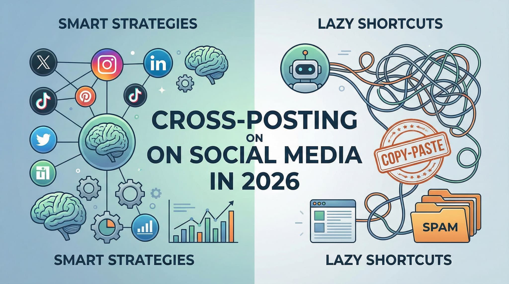
Cross-Posting on Social Media in 2026: Smart Strategies vs. Lazy Shortcuts for Beginners
Cross-posting sounds like a dream solution for busy entrepreneurs: post once, reach everywhere. But here's the uncomfortable truth that most social media guides won't tell you—dumping identical content across LinkedIn, Instagram, TikTok, and Twitter is a fast track to mediocre engagement and wasted potential. In this practical guide, we'll walk you through the difference between smart cross-posting (strategic, customized, efficient) and lazy cross-posting (one-size-fits-all disaster), complete with platform-specific templates, real-world examples, and a decision matrix to help you determine which content actually deserves to be cross-posted.
Jan 31, 2026
Read more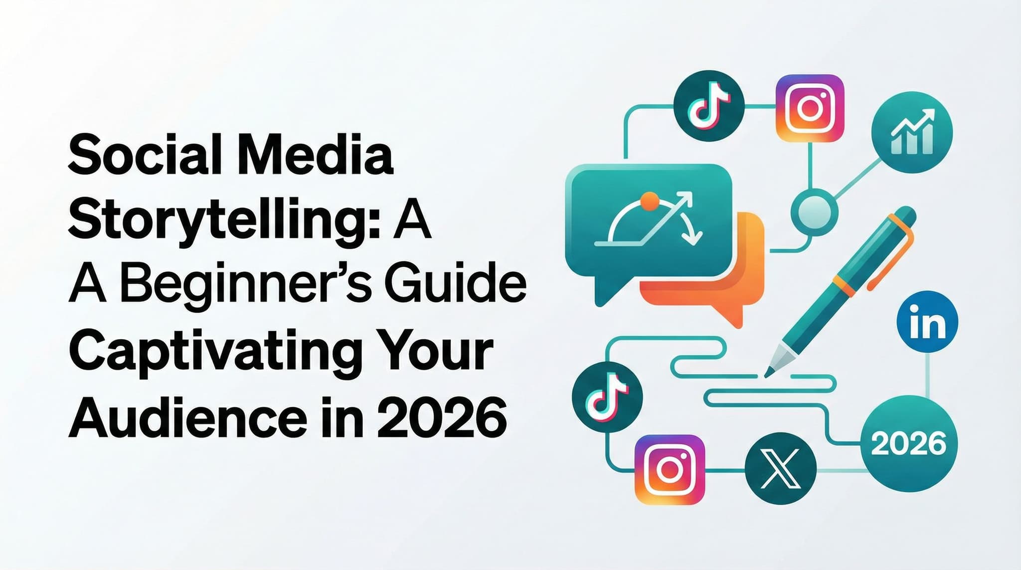
Social Media Storytelling: A Beginner's Guide to Captivating Your Audience in 2026
Discover how to master social media storytelling without expensive tools or years of experience. This comprehensive guide walks you through emotional-first storytelling techniques, platform-specific strategies, and actionable frameworks that turn ordinary posts into audience connections. Learn the psychology behind why stories work, get platform-specific templates for Instagram, TikTok, LinkedIn, and Facebook, and uncover the real secrets small business owners are using to build loyal communities. Perfect for entrepreneurs, content creators, and social media managers ready to tell stories that actually matter.
Feb 1, 2026
Read more
Social Media Challenges & Trends in 2026: The Strategic Framework for Sustainable Visibility Growth
Social media challenges have become the currency of online visibility, but jumping into every trending hashtag is a recipe for wasted effort and brand confusion. This comprehensive guide moves beyond surface-level participation advice to give you a strategic framework that separates viral moments from sustainable growth. Learn how to identify trends before saturation, assess brand safety risks, optimize for platform-specific algorithms, and build authentic community engagement that lasts long after the trend fades. Whether you're a content creator, small business owner, or influencer, discover the decision-making process that separates brands that gain lasting visibility from those that experience backlash.
Feb 1, 2026
Read moreReady to never miss a post again?
Tell Aidelly what to post. It drafts, schedules, and publishes across 9 platforms while you focus on your business.